Chartify AI Review: AI Chart Generator For Business Professionals
Do you ever feel like your data is a tangled mess of numbers and figures? Like trying to navigate a maze blindfolded? Well, Chartify AI is here to be your guide. With its AI-powered chart generation, Chartify can turn your chaotic data into beautiful, easy-to-understand visualizations.
Imagine having a personal data artist at your fingertips, ready to create stunning bar graphs and line charts with just the click of a button. That’s exactly what Chartify offers.
In this article, we’ll look in-depth at this revolutionary software – from its features and ease of use to pricing and user testimonials.
So buckle up and get ready to explore the world of data visualization with Chartify!
Key Takeaways From This chartify AI Review
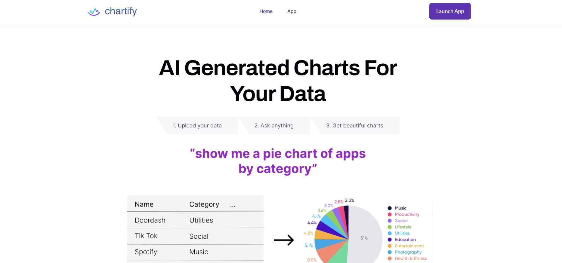
- Chartify is a software that converts CSVs and database tables into rich, interactive charts and graphs.
- Its standout feature is AI-powered chart generation, which suggests new ways to visualize data and allows users to explore data from multiple perspectives.
- Chartify can be used across various sectors and professions, making it a versatile tool for anyone who regularly works with data.
- The website does not provide specific information about pricing, so potential users may need to contact Chartify directly or sign up on their platform for more information.
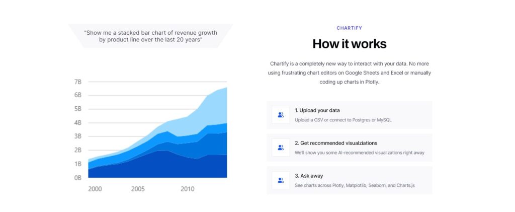
Ai Chart Generator And Data Visualization Platform
If you regularly work with data, Chartify can help you understand it by providing a visually appealing and intuitive way to understand complex data sets through its AI-powered chart generation. With its cutting-edge software, Chartify converts CSVs and database tables into interactive charts and graphs that allow users to explore their data from multiple perspectives.
One of the standout features of Chartify is its ability to suggest new ways to visualize data. Its AI-powered chart generation offers a range of options, including pie charts, line graphs, and bar charts. This innovative approach allows users to uncover insights that might otherwise remain hidden.
Chartify’s versatility makes it an ideal platform for anyone who works with data. Whether you’re a student working on a research project or a business leader making strategic decisions, Chartify can help you make sense of your data.
However, potential users may need to contact Chartify directly or sign up on their platform for detailed pricing information.
Related: Cheatlayer AI Review: A Powerful Business Automation Tool For Increased Productivity
AI-Powered Chart Generator
You may be surprised by the variety of chart options suggested by Chartify’s AI-powered feature, opening up new avenues for exploring and understanding your data. This innovative approach to chart generation offers options beyond the traditional pie charts and bar graphs, providing users with various visualization options.
Chartify’s AI-powered chart generation is particularly useful for those who may not have extensive experience in data visualization or analysis. The platform can suggest new ways to visualize data that users may not have previously considered, allowing them to explore their data from multiple angles and uncover insights that were once hidden.
Many users have praised Chartify’s AI-powered feature for its ability to generate charts they hadn’t thought of before. This approach has helped researchers find patterns in their data sets, developers better understand user behavior and business leaders make informed strategic decisions based on visualized data.
Chartify’s AI-powered chart generation is a valuable tool for anyone working with data. It provides an easy-to-use yet powerful way of visually representing complex information.
Chartify User Testimonials
As a potential user, seeing how others have used Chartify successfully is reassuring.
Ph.D. student Amy X Lu praised the platform’s powerful new way of talking to data. According to her, Chartify has helped her generate various charts that she hadn’t previously considered. This has allowed her to explore data from multiple perspectives and uncover insights that might otherwise remain hidden.
Similarly, Senior Frontend Developer Emily York highlighted the trust placed in Chartify by many people and companies. She stated that Chartify’s AI-powered chart generation feature is a game-changer for anyone who regularly works with data. The feature suggests new ways to visualize data, offering a range of options from pie charts to line graphs and bar charts.
Overall, these user testimonials demonstrate the versatility and power of Chartify as a data visualization tool. Whether you’re a student working on a research project or a business leader making strategic decisions, Chartify can help you make sense of your data intuitively and visually appealingly.
Versatile Chartify AI Applications
With its ability to convert CSV and database tables into rich, interactive charts and graphs, Chartify is a versatile data visualization tool that can be used across various sectors and professions. Whether you’re a student working on a research project, a developer trying to understand user behavior, or a business leader making strategic decisions, Chartify can help you make sense of your data.
Chartify’s versatility lies in its offering a range of chart types that can suit different purposes. The AI-powered chart generation feature suggests new ways to visualize data, offering options from pie charts to line graphs and bar charts. This means that you can choose the chart type that best suits the nature of your data and what you want to communicate with it.
In addition, Chartify’s interactive charts allow for deeper data exploration by enabling users to interact with the chart elements, such as zooming in or out on specific areas. This is especially useful when dealing with large datasets or complex relationships between variables. With Chartify’s versatility, you can engagingly present your findings while still being able to delve deeper into the nuances of your data.
| Column A | Column B | Column C | Column D | Column E |
|---|---|---|---|---|
| Student Researcher | Developer | Business Leader | Healthcare Professional | Journalist |
| Analyzing survey results | Tracking website traffic | Identifying market trends | Analyzing patient outcomes | Visualizing election results |
| Line graph | Bar chart | Area graph | Scatter plot | Pie chart |
The table above illustrates how different professionals could use Chartify for their respective roles and situations by highlighting examples of what they might use it for and suggested chart types. As shown above, healthcare professionals may find scatter plots useful for analyzing patient outcomes, while journalists could utilize pie charts when visualizing election results. Chartify’s versatility can make it an indispensable tool in various industries, helping professionals to understand their data better and communicate their findings effectively.
Ease of Use
Experience seamless data visualization with Chartify’s user-friendly interface. Here are three reasons why you’ll love using Chartify:
- Intuitive Design: Chartify’s interface is designed to be easy to use, even for those not experienced in data visualization. The platform offers a drag-and-drop feature that lets users upload their CSV or database tables and start visualizing their data immediately. Additionally, the AI-powered chart generation feature suggests various chart types, allowing users to explore new ways of presenting their data.
- Customization Options: While Chartify provides pre-built templates for charts and graphs, it lets users customize them according to their preferences or branding needs. Users can change colors, fonts, labels, and other design elements to match their style or convey the desired message effectively.
- Tutorials and Support: Plenty of resources are available on the website for those who need help getting started with Chartify or want to learn more about its features and capabilities. These include tutorials, documentation, FAQs, and customer support through email or chat. Moreover, the company regularly updates its platform with new features based on user feedback and industry trends.
Overall, Chartify’s ease of use makes it an ideal tool for anyone looking for a hassle-free way to create charts and graphs from raw data quickly. Whether you’re a novice or an expert in data analysis, Chartify simplifies the process of visualizing complex information into actionable insights that can drive informed decisions across any field or industry.
Chartify Alternatives: A Comparative Review
Chartify has made a name for itself as a powerful tool that turns CSVs and database tables into rich, interactive charts and graphs. Its AI suggests new ways to visualize data, making it a go-to solution for many. However, there are several alternatives to Chartify that offer their unique features and benefits. In this article, we’ll explore some of these alternatives.
Slides.ai
Slides.ai is a robust tool that helps you create stunning presentations with ease. It offers a wide range of templates and design elements, allowing you to create professional-looking slides quickly. However, unlike Chartify, Slides.ai focuses more on presentation creation than data visualization.
Visme
Visme is another powerful tool that allows you to create engaging presentations, infographics, and other visual content. It offers many templates and customization options, making it a versatile tool for all your visual content creation needs.
Notion AI Charts
Notion Charts is a feature within the popular productivity tool, Notion. It allows you to create simple charts and graphs within your Notion workspace, making it a convenient option for those who already use Notion for their productivity needs.
Chart.js
Chart.js is a powerful JavaScript library that allows you to create beautiful charts and graphs for your web applications. It offers a wide range of chart types and customization options, making it a versatile tool for data visualization.
ApexCharts
ApexCharts is another JavaScript chart library that offers a wide range of chart types and features. It’s known for its interactive and responsive charts, making it a great alternative for those looking for more advanced data visualization options.
In conclusion, while Chartify offers a unique set of data visualization features, several market alternatives might better suit your specific needs. Always consider your specific needs and budget when choosing a tool for data visualization.
Potential Chartfiy AI Pricing Information
Now that you’ve got a good idea of how easy it is to use Chartify let’s talk about potential pricing information.
While the website doesn’t provide specific details on their pricing plans, they do offer a free trial for new users. This would be a great opportunity for you to test out the platform and its features before committing to any payment plan.
If you’re interested in using Chartify beyond the free trial period, you may need to contact them directly or sign up on their platform for more detailed pricing information.
Keep in mind that Chartify offers a range of features and capabilities that can benefit various professions and sectors, so their pricing structure may vary depending on your needs.
It’s worth noting that while cost is an important factor when choosing any tool or software, it shouldn’t be the sole determining factor. Consider what value Chartify could bring to your work and whether it aligns with your goals and objectives.
With its AI-driven approach to chart generation and visually appealing interface, Chartify has the potential to transform the way you interact with data.
Tutorials and Resources
You’ll find plenty of helpful guides and materials available to aid you in utilizing Chartify’s features to their fullest potential. Chartify offers tutorial videos, articles, and walkthroughs covering everything from basic chart creation to more advanced features like customizing colors and data labels.
These resources are accessible on the Chartify website and can be accessed by anyone who signs up for an account. In addition to the tutorials, Chartify provides a community forum where users can ask questions, share ideas, and get support from other users.
This forum is a valuable resource for beginners who need help getting started with the platform or for experienced users looking for new ways to use Chartify’s features. If you’re still struggling to get started with Chartify or have specific questions about how to use certain features, you can also contact their support team directly.
They offer email support as well as live chat options during business hours. Overall, whether you’re a beginner or an experienced data analyst, plenty of resources available through Chartify can help you become proficient in using their AI-powered chart generation software.
Overall Value and Benefits of Ai Chart Generator
The versatility of Chartify as a data visualization tool provides a visually appealing and intuitive way to understand complex data sets for various sectors and professions. Whether you’re a student working on a research project, a developer trying to understand user behavior, or a business leader making strategic decisions, Chartify can help you make sense of your data.
With its AI-powered chart generation feature, Chartify offers new ways to visualize data that may have been previously overlooked. Using Chartify can also save time and resources in the long run. Instead of manually creating charts and graphs from scratch, which can be time-consuming and prone to errors, Chartify automates this process with AI capabilities. This allows users to focus their efforts on analyzing the insights provided by the visualizations rather than spending valuable time creating them.
Users have praised Chartify for its ability to suggest new ways of visualizing data they had not previously considered. This innovative approach allows for more creative data exploration from multiple perspectives, leading to deeper insights that might otherwise remain hidden. The benefits of using Chartify as a powerful data visualization tool are clear: it saves time and resources while providing visually appealing and intuitive ways to analyze complex datasets across various sectors and professions.
Related: Bitskout AI Review: Best AI Workflow Automation Software For Modern Workforce
Frequently Asked Questions
Can Chartify automatically update charts and graphs as new data becomes available?
Imagine your charts and graphs updating themselves as new data rolls in. With Chartify, you can do just that! This AI-powered tool automatically refreshes your visuals, saving you time and effort.
What types of data sources can be imported into Chartify AI , besides CSVs and database tables?
Chartify can import data from various sources, including Excel spreadsheets and Google Sheets. However, it’s important to note that the platform is primarily designed to work with CSVs and database tables.
Does Chartify offer customization options for chart styles and colors?
Chartify offers extensive customization options for chart styles and colors. You can tailor your charts to match your brand or personal preferences, adding a touch of creativity and making data visualization even more exciting – like painting a masterpiece!
How does Chartify ensure the security and privacy of user data?
Chartify ensures the security and privacy of user data through encryption, authentication protocols, and regular system updates. User data is stored on secure servers and access is limited to authorized personnel only.
Can Chartify integrate with other data analytics tools and platforms?
Yes, Chartify can integrate with other data analytics tools and platforms. It offers API and SDK options for easy integration, allowing users to import data from various sources and export charts to different formats.
Conclusion
So, after reading this in-depth review of Chartify, you may be wondering if it’s really worth the investment. Well, let us tell you that the answer is a resounding yes!
With its AI-powered chart generation and user-friendly interface, Chartify makes data visualization not only easy but also enjoyable. But don’t just take our word for it. Many users have already tried and tested Chartify and have nothing but positive things to say about it.
From data scientists to business leaders, people from all industries have found value in using Chartify to explore and understand complex data sets. So why not give Chartify a try?
With its potential pricing information and abundance of tutorials and resources available online, you’ll be able to make informed decisions about your data without breaking the bank or spending hours trying to figure out how to use a new tool. Trust us when we say that once you start using Chartify, you won’t want to go back to your old ways of generating charts and graphs manually. Follow for the latest information on Ai Tech Reviews The Tech Index